
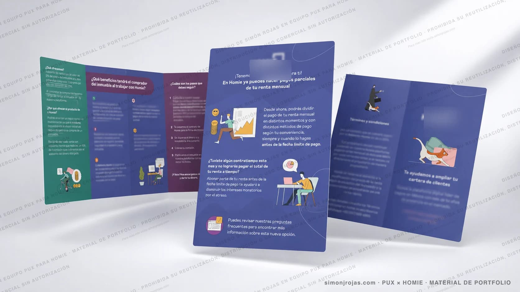
Homie Flyers & Brochures
Commercial and informational pieces designed to communicate Homie's products, benefits and processes in a visual, clear and actionable way.
- Graphic Design
- Marketing Design
- Flyers
- Brochures
- Product Communication
- Sales Enablement
- PropTech
- Homie
- RoleGraphic / Marketing Designer
- Year2023
- ClientHomie
- TeamPUX
- TypeFlyers / Brochures
Visual pieces that turn commercial information into clear messages.
Homie needed graphic materials that could explain products, benefits and product news in a clear and visual way. The pieces were designed to support commercial communication, make information easier to understand and reinforce key messages across digital and downloadable formats.
- FormatFlyers and brochures
- GoalCommunicate products and benefits
- AudienceOwners, buyers, partners
- OutcomeCommercial support pieces
The problem
In a real estate platform, many products and processes need a clear explanation: payments, benefits, commissions, steps or new features. These materials helped translate commercial and operational information into visual pieces that were easier to read, share and understand.
- Simplify commercial information.
- Explain product or service benefits.
- Guide users through clear steps.
- Announce product news.
- Keep visual consistency with the brand.
- Create pieces that work in digital and PDF formats.
- Support sales conversations.
Users involved
Owners and buyers
People evaluating whether to sell, buy or rent who need to understand benefits, fees and steps before making a decision.
Active tenants
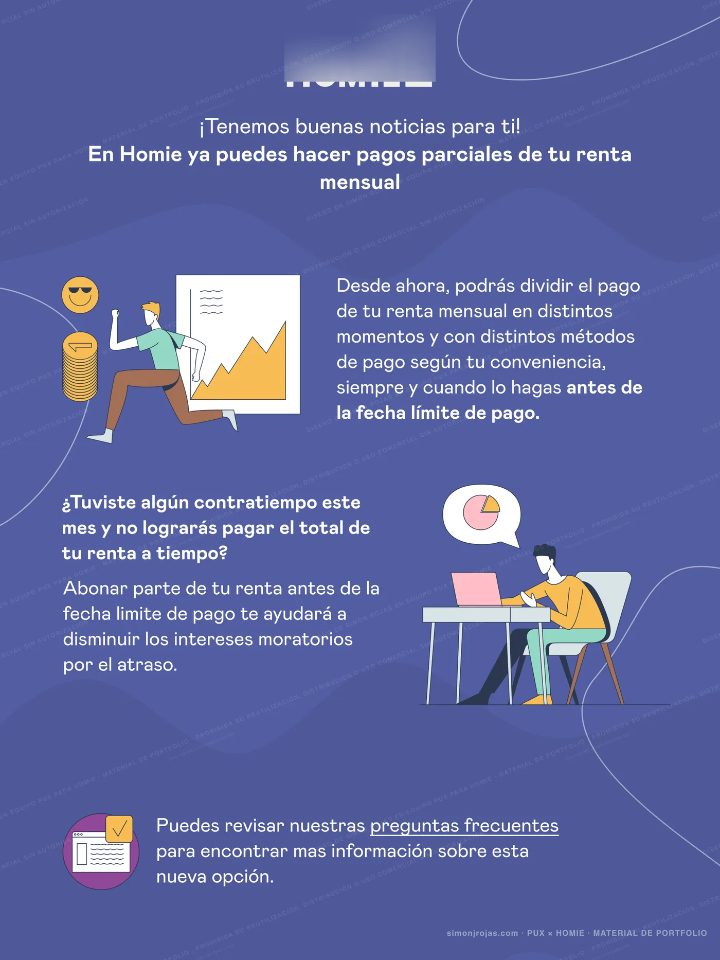
Users with an ongoing lease who need clear explanations about new payment options and processes.
Partners and sales team
Advisors and strategic partners who used these pieces as support in commercial conversations.
Design challenge
The challenge was to turn commercial messages with multiple conditions, benefits and steps into visual pieces that were clear, attractive and easy to understand. The pieces had to be informative without feeling crowded, stay on brand and work across different touchpoints.
- Question 01
How can commercial and operational information be turned into visual pieces that are easy to read, share and act on?
- Question 02
How do you balance information density with visual clarity in a single sheet?
- Question 03
How can Homie's voice be preserved without overloading the piece with graphic elements?
Graphic Designer / Marketing Designer
Material designed by Simón Rojas within Team PUX for Homie. I worked on the visual structure, content hierarchy, graphic composition, message adaptation, selection of visual resources and consistency with Homie's identity.
How I approached it
- Step 01
Commercial brief
I gathered the goal of each piece with the PUX team: who it spoke to, what it had to make clear and what action it had to trigger.
- Step 02
Message structure
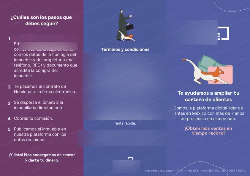
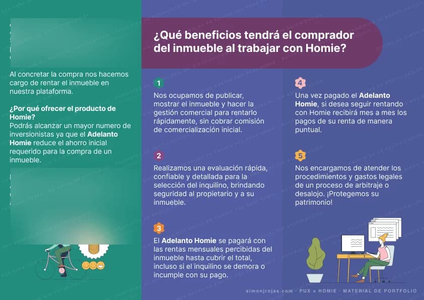
I organised the content into thematic blocks (benefits, steps, conditions and CTA) to guide reading with a clear hierarchy.
- Step 03
Visual design
I applied Homie's identity, illustrations, color by section and clean typography so the piece felt ordered and approachable.
- Step 04
Format adaptation
I adjusted each piece so it could work as a digital flyer, downloadable PDF or printed commercial material depending on the use case.
Proposed solution
The pieces were designed with color blocks, illustrations, typographic hierarchy and clearly differentiated sections to make reading easier. The visual narrative organises benefits, steps and conditions in a scannable way that stays consistent with Homie's brand.
- Informational flyers
- Commercial brochures
- Explanatory leaflets
- Process infographics
- Sales support material
- Downloadable digital pieces
Design decisions
- Split long-form information into thematic blocks.
- Use illustrations to humanise commercial messages.
- Give key phrases stronger visual weight.
- Separate benefits, steps and conditions to improve understanding.
- Use color as a visual navigation structure.
- Stay consistent with Homie's graphic identity.
- Design pieces that work as digital and PDF.
- Avoid visual saturation even when the piece carries dense information.
- Adapt the visual language to the audience of each piece.
Tools and technologies
- Figma
- Illustrator
- Information Design
- UX Writing
- Brand Assets
Outcome
- Flyers and brochuresFormat
- 2023Year
- Commercial communicationFocus
- HomieClient
Prototype gallery
 Abrir imagen
 Abrir imagen
 Abrir imagen
Learnings
This project reinforced the importance of designing commercial pieces as comprehension tools, not just promotional material. When a product or process has benefits, conditions and steps, design has to help the user quickly identify what is being offered, why it matters and what to do next.
- Flyers also need UX hierarchy.
- Commercial communication improves when it is organised by benefits and actions.
- Illustrations help humanise financial or real estate products.
- Color can work as a reading guide.
- A downloadable piece must stand on its own without further explanation.
- Sanitisation and watermarking are part of publishing materials that were originally created for internal use.
Material designed by Simón Rojas within Team PUX for Homie. Some logos, data, commercial copy and contact details were hidden or blurred to protect brand information, privacy and internal use; the images are shown only to represent the visual structure, design and type of communication developed.
Want to see how I apply this approach to other products?
Write me and tell me what you have in mind. I work with teams of any size to build digital solutions that generate real impact.