
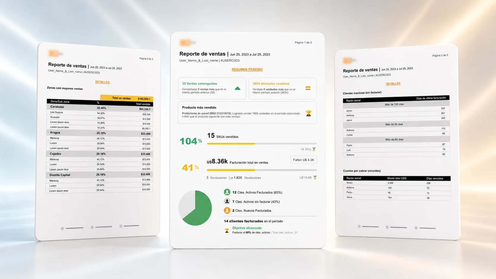
ERP Sales Report PDF Design
Design of a PDF report to visualize sales performance, targets, products, customers and commercial zones within an ERP system.
- UI Design
- Data Visualization
- PDF Report
- ERP
- Sales Analytics
- Information Design
- Business Reporting
- RoleUI Designer
- TypePDF Report Design
- AreaERP / Sales Analytics
- DeliveryApproved visual proposal
- FormatMulti-page PDF
A report that doesn't just inform, it helps decide.
The project consisted of designing a visual proposal for a PDF report generated from an ERP system. The client needed to consolidate commercial indicators into a professional, clear and easy-to-read document, enabling them to evaluate the performance of sales advisors, products, customers and commercial zones during a given period.
- FormatMulti-page PDF
- GoalVisualize sales performance
- UsersSales & admin teams
- OutcomeProposal approved by client
The problem
The ERP system needed to generate a PDF sales report with enough information to evaluate the commercial performance of an advisor over a specific period. The challenge was to present operational and financial data in a clear, visual and professional way, without making the report feel like a plain table dump.
- Professional header.
- Advisor name and code.
- Reporting period.
- Target, amount sold and remaining amount.
- Products and SKUs sold.
- Best-selling product.
- Active, billed and new customers.
- Sales by zone and city.
- Previous month sales.
- Returns in quantity and amount.
- Inactive customers.
- Overdue accounts receivable.
Design challenge
The main challenge was organizing a large amount of commercial data into a PDF that was visually compelling, easy to scan and useful for decision-making. The report had to combine summary metrics, detailed tables, comparisons, progress indicators and actionable data without losing clarity.
- Question 01
How to turn a data-heavy operational report into a clear, professional and easy-to-interpret experience?
- Question 02
How to separate executive reading from operational reading within the same PDF?
- Question 03
How to communicate progress against sales targets in a simple and actionable way?
How I approached it
- Step 01
Brief
Gathered the client's requirement and the indicators the report needed to evaluate commercial performance.
- Step 02
Brand assets
Requested colors, typography and brand elements to keep coherence with the client's identity.
- Step 03
References
Analyzed reports, dashboards and progress communications to draw inspiration from simple ways of showing performance.
- Step 04
Structure
Organized content in three levels of reading: executive summary, commercial detail and risk follow-up.
- Step 05
Proposal
Designed the multi-page report with visual hierarchy, summary indicators and actionable tables.
Proposed solution
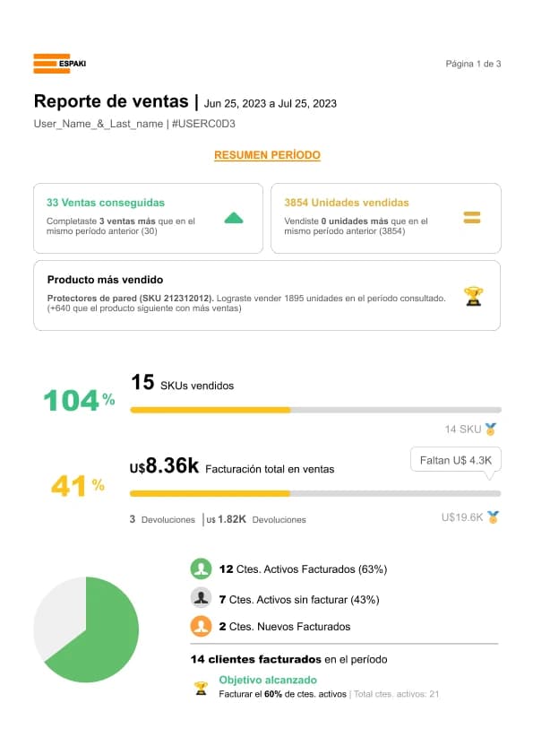
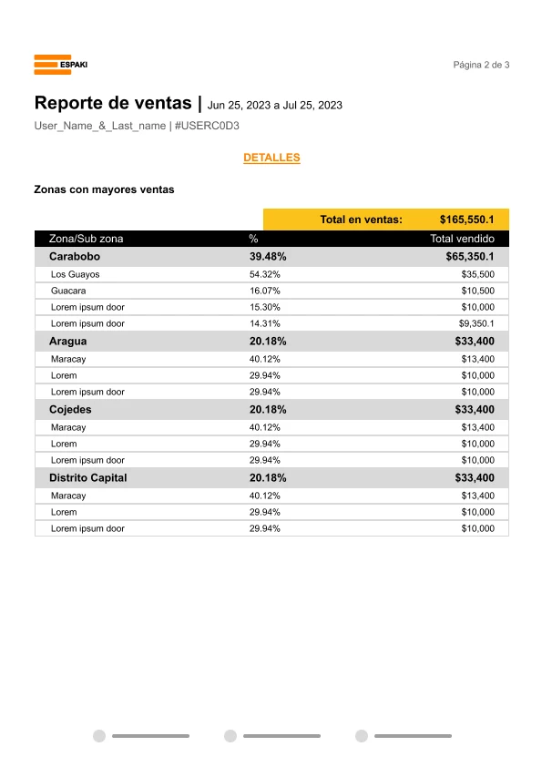
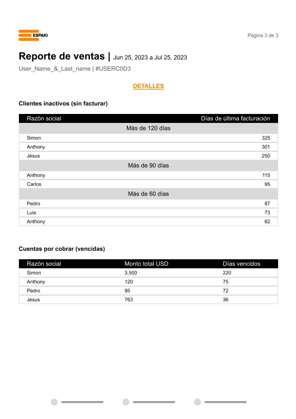
The proposal organized the report into three pages: an executive summary with key indicators, a section detailing sales by zone, and a final section for inactive customers and overdue accounts receivable. This structure separated strategic reading from operational reading.
- Executive summary
- Key indicators
- Target progress
- Featured product
- Customers and billing
- Detail by zones
- Inactive customers
- Accounts receivable
Design decisions
- Separate summary indicators from operational data to improve readability.
- Use cards to highlight key metrics.
- Include progress bars to represent advances against targets.
- Use color as semantic support to differentiate wins, alerts and categories.
- Group tables by information type to reduce cognitive load.
- Design the report for both digital reading and print.
- Keep a clear visual hierarchy to ease quick scanning.
- Keep tables simple to avoid friction with extensive data.
Tools and technologies
- Figma
- Information Design
- Data Visualization
- Brand Assets
Outcome
- Multi-page PDFFormat
- 3Designed pages
- Data visualizationFocus
- ApprovedStatus
Prototype gallery
 Abrir imagen
 Abrir imagen
 Abrir imagen
Learnings
This project reinforced the importance of designing business reports as reading experiences, not as plain data outputs. A good PDF generated from an ERP should let the user quickly identify what happened, what needs attention and where to dig deeper.
- Reports need hierarchy, not just information.
- Main metrics should be visible at first read.
- Tables remain useful when well organized.
- Color must support comprehension, not decorate.
- An ERP PDF can also convey brand professionalism.
- Designing for print and digital reading requires different decisions than a web screen.
For privacy reasons, the names, codes and values shown in the screens are referential data used exclusively to represent the visual and functional structure of the report.
Want to see how I apply this approach to other products?
Write me and tell me what you have in mind. I work with teams of any size to build digital solutions that generate real impact.